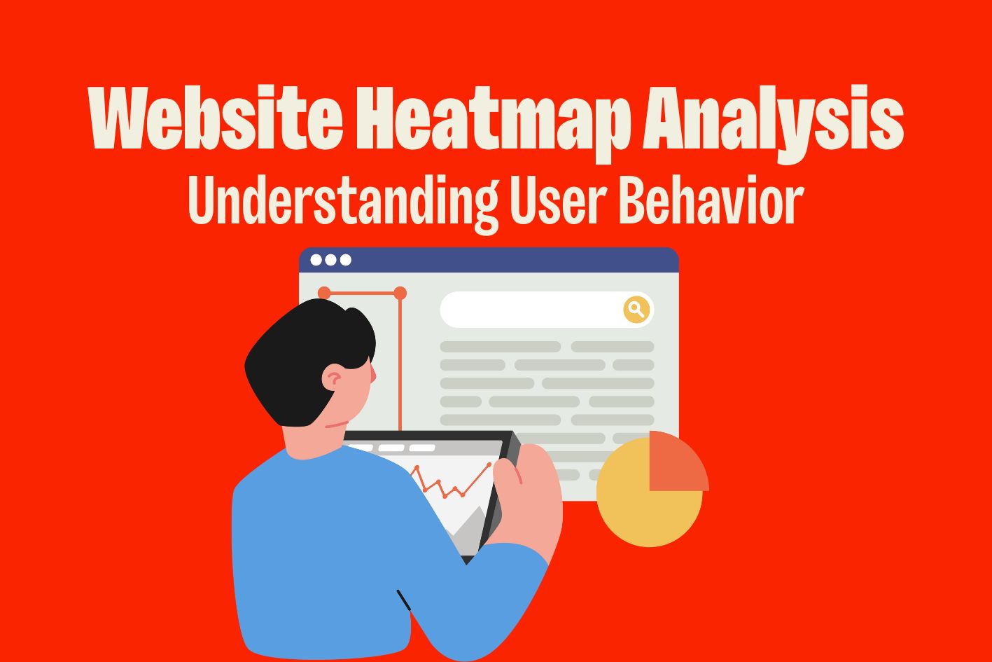
Understanding how users actually interact with your website can transform your conversion rates overnight. Website heatmap analysis provides a window into user behavior that traditional analytics simply can’t match, revealing the hidden friction points and opportunities that separate high-converting sites from the rest.
The numbers speak for themselves: businesses using heatmap analysis see an average 23% increase in conversions, with some reporting returns of $100 for every $1 invested in UX research. Yet most websites are flying blind, optimizing based on assumptions rather than actual user behavior data.
Table of Contents
What Are Website Heatmaps and Why They Matter
Website heatmaps are visual representations of user interaction data that show where visitors click, scroll, and move their mouse on your pages. Think of them as thermal imaging for your website—the “hot” areas reveal where users focus their attention, while the “cold” zones highlight neglected content or broken user expectations.
Unlike traditional web analytics that tell you what happened, heatmaps reveal how it happened. They bridge the gap between quantitative metrics and qualitative insights, showing the story behind your bounce rates, conversion data, and user journey analytics.
The Business Impact of Heatmap Analysis
The financial impact of proper heatmap analysis extends far beyond simple conversion optimization. Companies implementing comprehensive behavioral analysis see:
23% average conversion increase through targeted heatmap optimization strategies. This improvement comes from identifying and fixing the specific friction points that prevent users from completing desired actions.
$100 return for every $1 invested in UX research, making heatmap analysis one of the highest-ROI optimization activities available to businesses of any size.
50% reduction in customer support costs through better UX design. When users can intuitively navigate and complete tasks, support ticket volume drops dramatically.
Common eCommerce UX Problems Heatmaps Reveal
Heatmap analysis consistently uncovers the same critical issues across different industries and business types:
Navigation confusion leading to 68% cart abandonment – Users click on non-functional elements, struggle to find key pages, or get lost in complex menu structures.
Search functionality frustration affecting 30% of users – Poor search experiences create immediate exit points, especially when search bars are hard to find or return irrelevant results.
Mobile experience gaps causing 79% mobile abandonment – Touch targets too small, content cut off, or desktop-focused layouts that don’t translate to mobile interactions.
Trust signal deficiencies reducing conversions by 25% – Security badges, testimonials, and guarantees placed in low-attention areas where users never see them.
5 Essential Heatmap Analysis Techniques

Effective heatmap analysis requires systematic approaches that go beyond surface-level observations. These five techniques form the foundation of any successful behavioral analysis program.
1. Above-the-Fold Analysis
The content visible without scrolling represents your most valuable real estate. Above-the-fold analysis reveals how effectively you’re using this prime attention space.
Fold line identification across different devices ensures your critical content appears where users expect it. Desktop, tablet, and mobile viewports create different fold lines, requiring device-specific optimization strategies.
Critical content placement optimization involves mapping high-attention areas against your most important messaging, calls-to-action, and value propositions.
CTA positioning based on attention patterns moves beyond traditional best practices to place conversion elements where users actually look and interact.
2. Click Pattern Analysis
Click patterns reveal user intent more clearly than any other behavioral metric. This analysis identifies the gap between what users want to do and what your site allows them to do.
High-click areas vs intended interaction zones highlight broken user expectations. When users repeatedly click on non-interactive elements, it signals missed opportunities for engagement.
False affordances identification and correction addresses design elements that look clickable but aren’t, reducing user frustration and abandonment.
Navigation efficiency assessment measures how easily users can complete key tasks, identifying bottlenecks in your conversion funnels.
3. Scroll Behavior Assessment
Scroll data shows how deeply users engage with your content and where they lose interest. This analysis is crucial for content strategy and page structure optimization.
Content consumption patterns by page section reveal which information resonates with users and which sections get ignored completely.
Drop-off points identification pinpoints exactly where users stop scrolling, allowing you to restructure content for better engagement.
Engagement depth measurement correlates scroll behavior with conversion rates, helping prioritize content based on business impact.
4. Form Interaction Analysis
Forms represent critical conversion points where small improvements yield significant results. Heatmap analysis reveals field-specific abandonment patterns that traditional analytics miss.
Field-by-field abandonment tracking identifies which form elements create friction, allowing targeted optimization of problem areas.
Input difficulty identification reveals fields that require excessive effort or cause confusion, leading to streamlined form designs.
Completion rate optimization opportunities emerge from understanding user behavior patterns within forms, not just overall completion statistics.
5. Mobile vs Desktop Behavior Comparison
User behavior varies dramatically between devices, requiring separate analysis approaches for optimal results.
Device-specific interaction differences include touch vs click patterns, scrolling speed variations, and attention span differences that impact design decisions.
Mobile-first optimization priorities emerge from understanding how mobile users interact differently with navigation, content, and conversion elements.
Cross-device user experience consistency ensures seamless experiences while accommodating device-specific behavior patterns.
Popular Heatmap Analysis Tools Comparison

Choosing the right heatmap tool impacts both the quality of insights and the resources required for analysis. Each platform offers unique strengths suited to different business needs and technical requirements.
Hotjar
Features: Combined heatmaps, session recordings, and user surveys create a comprehensive behavioral analysis platform ideal for teams wanting integrated insights.
Pricing: Free tier supports up to 35 sessions per day, with paid plans starting at $32/month for businesses requiring larger sample sizes.
Best for: Small to medium businesses starting their behavioral analysis journey who need user-friendly tools with minimal technical complexity.
Crazy Egg
Features: Specialized click tracking and scroll maps with integrated A/B testing capabilities make it ideal for conversion-focused analysis.
Pricing: Starting at $24/month for 30,000 pageviews, offering cost-effective solutions for established websites with consistent traffic.
Best for: eCommerce businesses focused specifically on conversion optimization with clear ROI requirements.
FullStory
Features: Advanced session replay capabilities with powerful search functionality and automated frustration scoring provide enterprise-level insights.
Pricing: Enterprise-focused pricing starting at $199/month reflects the platform’s comprehensive feature set and scalability.
Best for: Large businesses with complex analytics needs requiring detailed user journey analysis and advanced behavioral insights.
Step-by-Step Heatmap Analysis Process

Successful heatmap analysis follows a structured methodology that ensures reliable insights and actionable optimization opportunities. This process maximizes the value of your data collection efforts while minimizing analysis time.
Phase 1: Setup and Data Collection (Week 1)
Minimum sample size: 1,000 sessions for statistical significance – Smaller sample sizes lead to unreliable patterns that don’t represent true user behavior.
Page selection criteria: high-traffic, conversion-critical pages focus your analysis efforts on pages with the greatest business impact potential.
Tool configuration and tracking code implementation requires careful setup to ensure accurate data collection across all target pages and user segments.
Phase 2: Pattern Identification (Week 2)
Heat intensity analysis and user journey mapping reveals the relationship between attention patterns and conversion paths.
Anomaly detection and hypothesis formation separates genuine insights from statistical noise, focusing attention on actionable opportunities.
Cross-device behavior comparison and insights ensures optimization strategies account for different user contexts and interaction methods.
Phase 3: Insight Generation and Testing (Week 3-4)
Optimization opportunity prioritization matrix ranks potential improvements by impact and implementation difficulty.
A/B testing setup based on heatmap insights validates optimization hypotheses with controlled experiments.
Implementation planning and timeline development ensures insights translate into actual website improvements within reasonable timeframes.
Interpreting Heatmap Data for Conversion Optimization
Raw heatmap data requires interpretation frameworks that connect user behavior patterns to business outcomes. The most successful optimization programs focus on high-impact insights rather than minor tweaks.
Identifying High-Impact Optimization Opportunities
Dead zones with valuable content repositioning needs represent immediate opportunities to improve user engagement and conversion rates.
Over-clicked elements that should become interactive reveal user expectations that your current design doesn’t meet.
Attention hotspots for strategic CTA placement provide optimal locations for conversion elements based on actual user behavior.
Common Heatmap Insights and Actions
Low scroll rates indicating content restructuring needs suggest above-the-fold optimization or content hierarchy improvements.
Click concentration patterns revealing user intent misalignment highlight gaps between what users want and what your site offers.
Form field issues causing abandonment point to specific optimization opportunities with measurable conversion impact.
Measuring Heatmap Optimization Success
Effective measurement frameworks connect behavioral improvements to business outcomes, proving the value of optimization investments while identifying areas for continued improvement.
Before and After Analysis Framework
Conversion rate comparison methodology establishes clear baselines and measures optimization impact across different user segments and time periods.
User engagement metric improvements track scroll depth, time on page, and interaction rates to measure behavioral changes.
Revenue impact quantification and attribution connects behavioral improvements to actual business outcomes, justifying continued investment in optimization.
Statistical Significance and Sample Sizes
Minimum session requirements: 1,000+ for reliable patterns – Smaller datasets lead to optimization decisions based on statistical noise rather than genuine user behavior.
Confidence interval calculations for optimization impact ensure improvements are statistically significant and likely to persist over time.
Ongoing monitoring and iteration strategies maintain optimization momentum through continuous measurement and improvement cycles.
Frequently Asked Questions
How many sessions do I need for reliable heatmap data? Minimum 1,000 sessions for basic patterns, 5,000+ sessions for detailed behavioral insights, 10,000+ sessions for A/B testing validation.
How long should I collect heatmap data? Minimum 2 weeks for seasonal variation capture, 30 days recommended for comprehensive analysis, ongoing collection for continuous optimization.
Should I analyze mobile and desktop heatmaps separately? Yes – user behavior differs significantly by device. Mobile users show different interaction patterns and expectations. Separate analysis leads to device-specific optimization opportunities.
Can heatmaps replace user testing? Heatmaps show what users do, not why they do it. Best used in combination with user interviews and usability testing. Heatmaps provide quantitative data, user testing provides qualitative insights.
What’s the difference between heatmaps and session recordings? Heatmaps aggregate behavior across all users. Session recordings show individual user journeys. Use together for complete behavioral understanding.
How to Conduct Effective Heatmap Analysis
- Install heatmap tracking on key pages (homepage, product pages, checkout)
- Collect minimum 1,000 sessions over 2+ weeks
- Analyze click patterns and identify user intent mismatches
- Review scroll behavior and optimize content placement
- Create optimization hypotheses and test with A/B testing
Ready to unlock your website’s conversion potential? Download our Free Heatmap Study Planner Google Sheet to plan your analysis, or Upload Your Screenshot for Free Analysis to get started immediately.